Showing posts with label Lyrics and Type. Show all posts

Andy Smith


I have already done a post on Andy Smith but it was just showing one of his books - and I thought I had posted these images on another post a while before it but I must have dreamt it.

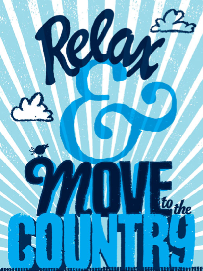
Although does do some illustration, a lot of his work is type as image. Similar to some other artists I have already posted, I think its the simplicity of his work that draws me to it and I could definately see myself producing something like this. Another point that I like about is...the recurring theme for me...of backgrounds, especially the one on the first 'Watch this space' piece. There isn't much too it, but it gives the type some sort of scale. This is something I may incorporate into one of my briefs.

Cardon Copy


I absolutely love this project. Their mission statement is:

'Cardon copy, takes the vernacular of self-distributed fliers and tears-offs we have al seen in out neighbourhoods. It involves hijackaing these unconsidered fliers and redesigning them, over powering their message with a new visual languge. I then replace the original with the redesign in its authentic environment.'

Not only is it a good example of self initiated work - its also an inventive, creative way of getting your work seen. And, they look really good...which helps.


NVasion


In all honesty...as a whole piece, I don't really like this...it just looks kind of messy.

But what I do like about it is the reverse out text with the map in the background, it just adds a little bit to the message.

Rik Lee Type as image


When I came across this artist, it was was one of those 'wow' moments.
I discovered him because the first piece shown on this post was actually from the first Lyrics and Type exhibition that Timba Smits hosted in Australia, and the that I looked at his work - the more I liked it.

The pieces like the lyrics and type one, the 'gin and juice' and 'don't forget' - they're are all type as image but its totally readable because the structure of the typeface it is based on is still there - it shows that to make some this visually engaging as a type as image piece, you don't have to completely remove the original typeface, just work with it.

The other pieces with the script text, I also love because it reminds me of tattoos (obviously because of the tattoo gun)...the texture in the lettering is really delicate and soft.

Mc Bess


I couldn't find a very high resolution image of this - but its an example of a piece from the first Lyrics and Type exhibition.

I personally think the second exhibitions pieces were a little stronger, visually, because of the colour pallette - but not taking this into account, as a type as image piece I do like this. I think somtimes, a mixture of type in one sentence can make it look jumbled and not very good...but in this instance it works.

Luke Lucas


These are just really good examples of how strong type as image can be - proven in that it doesn't need a background, its just flat black but they still look really strong.

I especially like the pieces where the imagery in the type reflects what its saying i.e. the 'I'll be home late honey...' piece, if it was any other sort of type it would just look like a basic sentence...but by using the lips and kissing image in the type, its clear that its communicating a lie that someone says when they're probably cheating...

Lee Crutchley


This was another of my Flickr finds. The pieces may aren't the most perfectly executed ones because its an ongoing project of his to just produce a visual response to lots of his favourite quotes/phrases.

I will definately take inspiration from this when it comes to visualising my ideas but also, it is something I would like to do in the future...not something for a studio brief, just a way of visually developing my work and producing visual responses to some of my favourite lines...because I have So many and I love words so I would definately enjoy it but by doing it in my own time, it means I don't have to do any contextual research or initial ideas just do it and move on to the next another day.

Ken Taylor


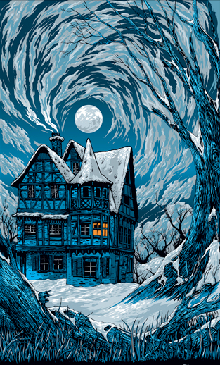
Another artist that I found when research the previous Lyrics and Type exhibition (the first piece shown in this post from it) - I was blown away by his work. Its so detailed and really does attract the eye.

Although I love all the pieces, my favourite is the final one - the portraits of Nicole Richie, Lindsay Lohan and Paris Hilton - they're kind of humorous just because of who they are but they do carry a real message; that they're ruining themselves. The style of drawing is beautiful.

Jill Howarth


Alex Trochut