WHJ3


I really like the realism or of WHJ3's work. It looks time consuming...but in instances like this its really worth it.
I especially like the first image, as its taken a popular image that most people would recognise...modernised it and added a 'twist'. I have already produced one kind of zombie images from my criminal damage brief, but now seeing this - I want to re-do it and make it look more realistic.

Munk One


Munk one is Amazing - however, its hard to find examples of their work that are big enough to put on my blog (when you look at them on their website, the images are Tiny).
Regardless of this - from the work that I can and have seen, I will Definately be taking inspiration from for my Criminal Damage brief as a lot of their work is apparel design for bands similar to those that wear Criminal damage.

Old Metal T-shirts


These were a few more metal tee's that I found that I liked - it just reiterates the common theme of skulls...and blood...and death.

Metallica T-shirts


Metalilca was another popular band that I noticed when looking at old metal tee's...
Once again, I like the typeface and again, skulls are a common theme.

Iron Maiden Tee's


In the information that I was sent from Criminal Damage - they mentioned that one of the things they were looking at and taking inspiration from was old metal tee's.

When searching through past examples, Iron Maiden was a popular one.
I really like Iron Maiden typeface - this is something I will work with.
Other aspects that are a strong theme through all the t-shirts are the layout of a circle with the image inside it...and skulls.

I also like the style of t-shirt that the print is on - I think its a baseball shirt? With the longer, coloured sleeves.

Steve May


May's work reminds me of a cartoon I used to watch when I was younger, I can't remember what it is - but I know I liked it, so I automatically liked May's work too!
Its really fun and I love the textures that he uses - most of the blocks of colour have some sort of texture in it like the hill on the first image.

Lo Cole


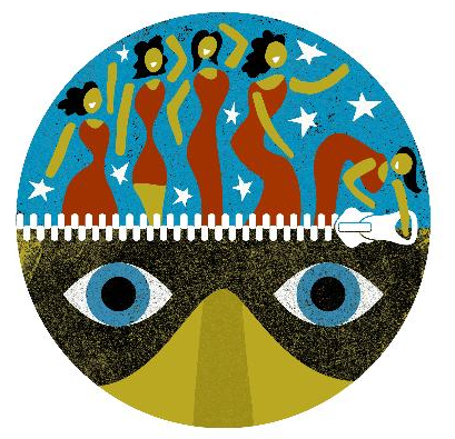
One of the articles I have chosen to illustrate for the Guardian will be in a circular frame. Lo Cole is a regular illustrator for another article in The Guardian which uses a circular frame.
Its a good way of seeing how much information your can fit into such a small frame without it becoming overpowered or too simple and bland.