
Andy Smith - Book


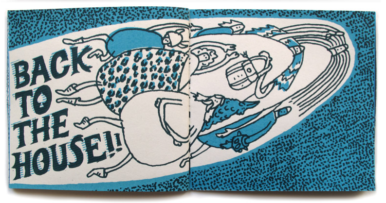
The main reason I was drawn to this book was the price - and the fact, I will be producing a book to sell at the book fair.
Andy Smith is an accomplished illustrator and this is a nice example of a screen printed book...which sells for £7.50.
So in reality, i can't expect to sell a simpler, student produced book for this much or any more.
This has definately helped when it comes to production costs and overall pricing.

James Benn


I really like all of Benns work. I think what draws me too it the most is that he chooses not to use any outline/stroke. They look like vectorised images and just by the use of colour, it differentiates the shapes in the images. Also, speaking of colour - I think the use of quite toned down colours work really well, instead of really vivid, saturated colours.

These are definately things I want to try and work with in the future.

GKImages


Another illustrator that has appeared in The Guardian.

I do think the images work well, and although the illustration style doesn't directly link with mine - I like the backgrounds used and similar to other artists that I have mentioned previously, I like them because they look good...but they don't detract attention from the main part of the image.

Gillian Blease

I'm not sure whether Blease will have done the whole of this advert of whether she just did the illustration. It does work well as a whole but I do really like the illustration in particular. Some people may have chosen to use a photograph because its just a fork with spaghetti letters but I think it works better as an illustration.
I really like the highlights on the lettering it - it is quite simplistic but it does make it look like juicy, saucy spaghetti letters.


These last 2 pieces were the ones that I had seen in The Guardian. In contrast to the first image, I don't like these as much. In my own opinion these are too simple and 'blocky'.

I really like the first image...but considering these last two are existing pieces from The Guardian, I don't find them particularly effective.

Frazer Hudson


I first Hudsons work in The Guardian...I actually like those images that I saw more than these.
I chose this set of images because they don't really have a common style/theme etc. so they could really have all been done by different people. This reiterates to me that have some sort of style is important...Hudson has done really well from himself but the images that I saw in the Guardian did look like they were done by the same artist - the work he has on his website doesn't really back this up.

Also - his website was very intereactive but in terms of just trying to see his work, it was quite annoying!

Clifford Harper


Harper is another illustrator that I found in the Guardian - I have to point out that his website is pretty bad...but the drawings are great.
I haven't seen his work before but it terms of shading, some of previous work is quite similar because I had used lines to represent it too. I haven't used lines quite to the extent that Harper has but I wish I had because the images work so well and they look like they would be textured.

The main inspiration I will take from his work is the line quality - it really adds something to the overall image.

Bill Brown


Brown is another regular illustrator for The Guardian. I really Really like all aspects of his work.
It doesn't really use much shading but the line quality represents the shading well enough.
I particularly like his architectural drawings - I like architectural illustrations anyway but the line quality and colours used here make a relatively simple street look fun and interesting.