Scale, Format - Eyechart

Obviously I knew what an eyechart was and looked like...but I have looked at a few different ones to look at different layouts that are used etc.

The examples below are quite average (obviously the 'OMG WTF' is a joke but the reverse out works well!) but they give me a range of options when it comes to composition and layout.


The images below are more creative or 'decorative' forms of eye charts; I really like the top right hand one mainly because I think the stock works really well. However, I have noticed they all seem to be vector images...but for my own work, I think I want to move away from vector art.

The main reason I'm putting the image below on here is because...I just really like the colour and composition of the image and obviously the eye chart is the main focus of the image so I think its an interesting way to photograph a somewhat a simple thing.

Sete Dias (Cristiana Couceiro)

Once again...another designer suggested in my crit feedback.
I think the use of opacity etc. to create another colour is really effective here...
Also, I think things especially like the 'Intelligencer' pieces somewhat lend themselves to motion graphics as you can image the animation 'building' the image.

Lovely.

Eduardo Recife

Another designer that was suggested in my crit; Eduardo Recife.
I'm glad I was introduced to them because it really is inspiring work, I especially like the mixture of hand-drawn type and illustration with photography and different textures.
I will definately be experimenting with this idea in my work...


Below are examples of Recife's typefaces that you can buy...but I just screen grabbed them (cheeky)

Sara Fanelli

Bizarrely, I hadn't thought to look at any print based media except for gossip magazines (Which I still need to post images of on here). Thankfully, a few were mentioned in the most recent crit which has really helped me develop my visuals.

A particular one that I hadn't thought of, but have previously appreciated the work of, was Sara Fanelli. Although I like her 'style', its not really a style of drawing similar to mine...however, her use of textures and different papers is something I definately want to work with. I may also take inspiration from the colour pallette and tones that she uses.

I really like her use of different type faces aswell, which I feel is something I need to work with.

Terry Gilliam

I've never really liked or paid much attention to the whole Monty Python thing, but I have caught seen little bits and thought the animation used on some parts was pretty humorous, yet I never thought of working with that style/idea until the crit last week.

It was suggested that someone else should look at the animation style and the name 'Terry Gilliam' was mentioned in the presentations right after we came back, after thinking of ways I could animate some of my 'stories', I decided to look more at Gillaim.

Storytime (1968)


A Miracle of Flight


Beware of the Elephants


Quintissential Gilliam


If I was to take inspiration from this work, it would be the idea of using a still image and cutting up or moving it around to create motion.

The whole cut out thing kind of reminds me of the 'Big Fat quiz of the Year' title sequence...which is a more contemporary example.

ZZZAP! and Mock the Week!

When discussing the idea I had for my title sequence in the most recent crit (20/1), someone suggested that it sounded similar to ZZZap! intro; the kids show from years ago....and it actually does! Maybe I was subconsciously inspired by it because I loved the show when I was younger.

It won't let me embed the video but here's the link:
http://www.youtube.com/watch?v=QtbWuYEp_eU

And some screen shots...


Another TV intro that was suggested to look at was 'Mock the week' and it is quite relevant really. Its more 'high tech' looking than what I'm going for, but the idea behind it is similar to mine.

Hand Job...(its a Book)

This summary is not available. Please click here to view the post.

The Guardian weekend magazine...

So, I went out and bought The Guardian on Saturday (16th) just to see the sort of images they use etc.

The following is for Tim Dowlings column, near the front of the magazine. Illustration by Benoit Jacques, it kind of reminds me of Quentin Blake? Kind of.
It basically illustrates exactly what the article is talking about...

This illustration is from the 'This column will change your life' page, by Kelly Dyson who mostly illustrates childrens book. I really like the style of it but I can't image that this is a column where they would use exactly the same style image every week so 'my options are open' to a certain extent.

This one is from the same page as the 'this column with change your life' article, therefore the equivalent to the facebook piece. I think the main aim here is just to use an appropriate image that will work at a small scale...in a circle.

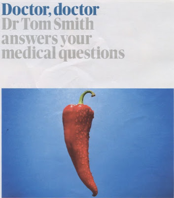
Before I even saw the magazine, I had already kind of decided that I wanted to use photography for this page and this just backs up my plans...
This image by Aaron tilley; extremely simple with a vivid colour use, work really well with the colour of the headline and the rest of the page.

The following images aren't from specific pages that we're working with...but I just thought they were nice examples of the style of imagery that the magazine uses.

This portrait of Steve Coogan by Desmond Muckian is great. I really like the colours as its almost black and white...except for his skin tone and the cropping of it works really well, with the negative space above his head.

The images below are simply good examples of editorial / documentary photography. The contrast is really effective for the subject.

Illustrators -

The following images are a few examples of some of the illustrations that have appeared in The Guardian and the supplement magazine in the past.

Frootful


Jitesh Patel


Nick Radford


Tom Gauld

Carl Flint - Storyboard Artist

I chose to look at some different storyboard artists, just to see how they approach their work.
One of my particular favourites that I found was Carl Flint; his client list includes Channel 4...

Channel 4 idents:


Ugly Betty preview:
I couldn't actually find the video to accompany this but its still a nice example...


Audience Profiles -

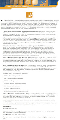
I felt that looking at magazines as well as TV channels would be particularly appropriate for my subject matter, as certain types of magazines sell by printing 'celeb stories', so the information on the audience for these could frame the appropriate audience for the proposed TV show.


From the same site I found information on 'the hits' music channel as they occasionally play 'countdowns' of things, not specifically celebrity stories by of popular music etc.

After seeing the audience profiles for celebrity orientated magazines, I went on to see what channels would be likely to show such a programme;

The above secondary research presented a selection of channels: Channel 4, E4, ITV2 etc.


As I personally watch BBCthree I know that they do show programmes similar to the one I would be creating a title sequence for i.e. Most annoying people 2009, Greatest songs of the noughties, therefore I also looked into them.
I think that I am going to

New Skins Trailer

I admit, I'm probably only so excited about this because I love Skins...
But I do think the colours, textures and patterns etc. work really well on this piece and although its not a title sequence, I would like to take inspiration from this somehow.

I can't upload the video, because of it being from channel 4...but here are some screen shots.

A lot of hand rendered imagery in there as well as digital stuff; this is something I would like to 'have a go' at.
x

16 and Pregnant

In my presentation, I cut this video so it was just a really short clip showing a small snimation, but this shows more of the kind of animation I spoke about - hand drawn, stop motion.
I think it works really well and would like to work in a similar way for my Top 10 title sequence, however I would like my drawings to be more detailed.

DUCK/LA

I'm not sure if this video will show up because of copyright...but I hope it does.
I think its great.

United States of Tara (US TV Show) -


Its a great use of the media available as it appears to be like a pop up book and you can see the texture of the paper but obviously, in this resolution its actually just on a flat computer screen and it works extremely well.
Love it.x

BBC...

A selection of title sequences from the BBC channels...

The Mighty Boosh -

I believe this wouldn't be to be done on after effects, but I still wanted to put it up here for context as...I like it, and I could still take inspiration from colour and type use.

The Noughties - Was That it? -

I appreciate that this video is animated well etc. however, I'm not really a fan of it as I find it quite...boring? I think it may have something to do with saturation of the colours that I don't like?


The Greatest songs of the Noughties -

(From 0:15 - 0:22)

Obviously its only the type part thats really appropriate for this module, and even though its quite short I think its a good, effective use of pace to colour in the letters and a contemporary, useful typeface has been used.

Wee Wise Words -

I've never actually seen this programme, however, I found it on iPlayer and thought the title sequence was really visually engaging with the bold colours and simple animations.

QI -


Graphics - JUMP

Channel 4 / E4

A selection of title sequences from Channel 4 or E4 -

Big Bang Theory -


Desperate Housewives -

I don't watch the show, but I like the title sequence, I read somewhere that this was done using After Effects (or a similar software) and that does seem likely.

Ho Ho Ho Selecta -


Ponderland -


Sunday Night Project -

Graphics - Vitamin

The Inbetweeners -

Graphics - Addiction
The is so simple in terms of colour and type but I think it works really well.

The IT Crowd -

Graphics - Shynola

Hello Charlie

I've known of Hello Charlie since 2008's Big Brother and respected them since.
The following video is the ending credits, designed by Hello Charlie, for the 'Jamie at Home - Christmas Special' (Shown on Channel 4) - Throughout the whole show they have quite a few little animations like this and I just think the hand-drawn look and interesting stocks that have been scanned in make this look really 'homely' and dare I say it 'Nice'.

JUMP and Jon Shore

E4 is one of the contexts that I think would be appropriate for my subject matter; for this reason, I spent some time looking at title sequences for popular shows on Channel 4 and E4.
The graphics for the followin piece were by JUMP; I've heard of them before but never really looked at them and now...I'm glad I know of them.

Big Fat Quiz of the Year -

I think this is great how it portrays humour just through the rotation and scale static images. In addition to being a good example of simple animation, I feel it is appropriate to my subject matter because the quiz does talk about celebrity events/stories throughout the show.

Balls of Steel -

(Can't show the video because of copyright...but here's screen shots)

Jon Shore did the graphics for the Balls of Steel title sequence, I think the limited colour pallette works really well on this piece and the transitions between each image are really simple but work well with the theme music and tone of the show.

UF6

All the following title sequences were designed by UF6 - A London based design company.

Primarily, I was just looking for the following title sequence as I saw it on BBCthree and thought it was really appropriate to the Top 10 that I decided on (Top 10 Celebrity stories of 2009)
Most Annoying People 2009 -


Most Annoying Couples -


Almost Famous -


They had a lot more examples of their work on their site but these were the ones I felt were most appropriate to the subject matter that I'm currently working with.
New favourite.x

Film Title Sequences

As I have chosen to do the Top 10... brief, I have looked at a variety of title sequences from film to TV.

'Catch Me If You Can' title sequence. -

This was one of the first videos that stood out to me when I simply typed in 'title sequence' on youtube.
The designer for this sequence seems to be quite a popular one for peoples contextual references - Saul Bass - from this piece, I can definately see why.
The limited colour pallette works really well; the manipulation of the type is simple but very effective and the texture of the animated people makes it look less flat as if it does actually have a texture.

'Being John Malkovich' title sequence -

Graphics/Motion design - Man versus Magnet.
Once again, a title sequence that stoof out to me. I think the movement of the 'camera' is quite interesting; the 'jerky' movment obviously goes along with the music but also creates quite a weird/creepy tone, which is appropriate for the movie.


'Juno' title sequence -

When this film came out, I heard a lot about the title sequence. I actually saw the title sequence but the film (That sounds obvious, but i mean I saw it about 2 month before I sat down and watched the actual film). The pacing and colours really set an appropriate tone for the film. Designed by Shadowplay Studios, I love it.


'500 Days of Summer' title sequence -
(I uploaded this to youtube - but I had to delete for copyright reasons...oops!
If it consequently get deleted off the blogger video aswell, I'll have to take stills from it)


Illustration by Dion Macellari.
When I went and saw this at the cinema, as soon as the title sequence came on I thought 'I am gonna LOVE this' and I honestly think the title sequence and animations formed my whole opinion on the film because the other people that I went with didn't like the film at all lol. The animation is subtle, but the textures, colour and typeface make an effective piece (in my opinion).