Lovely package...

I briefly had a look on the ever popular - Lovelypackage.com for some inspiration; at an initial glance, the following packaging designs stood out to me;

Wicked energy drink, designed by War Design, illustrations by Kian Forreal
The illustrator that War Design collaborated with on this design is actually a tattoo artist (which is pretty evident from the style of illustration), however, I really like how something that would typically be body art has been transferred on to a drinks can.
The fact its a dragon design and the nature of 'dragons', works well with the product; an energy drink and although it is still a generic can shape - I believe this one would stand out from other products on the shelves because of the bold imagery.

---------------------------------------------------------------------------------------------------------------
Jones Jumble bottle wrap, designed by SUPERBIG creative
These Jones Jumble bottle wraps for their summer drinks work really well, they each have a theme; City, woods and water and although they all look different, because of the illustration style (and branding) they work really nice as a range of drinks bottles.
Technically - the shape of the bottle is quite simple, so I'm sure just creating exciting, visually exciting bottle wraps is a lot cheaper than designing a new bottle shape to make them stand out on the shelf.
Not only do they work well, but because its a range...some people would probably buy a different bottle each to time, to have their own 'collection'.

---------------------------------------------------------------------------------------------------------------
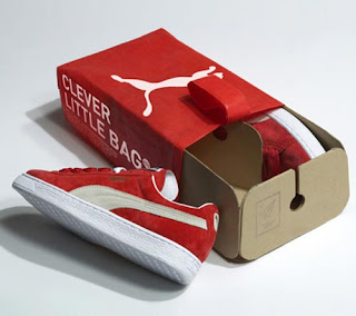
Puma; Clever Little Bag, designed by Yves Behar at Fuseproject
My main attraction to this was the innovation; instead of getting a shoe box which uses a lot of cardboard and space (if you don't have anything to do with it like use it for storage etc.)...you get a bag, which could be used for the gym etc.

'Why so clever? By providing structure to a cardboard sheet, the bag uses 65% less cardboard than the standard shoe box, has no laminated printing, no tissue paper, takes up less space and weighs less in shipping, and replaces the plastic retail bag. Now happy Puma customers will take home the clever little one instead. Oh, and that little bag is non-woven which means less work and waste (it is stitched with heat), and after accompanying you in your suitcase wherever you may go, our little friend is even recyclable.

With our “clever little bag”, Puma kicks-off the next pivotal phase of its’ sustainability program. The tens of millions of shoes shipped in our bag will reduce water, energy and diesel consumption on the manufacturing level alone by more than 60% per year. In other words: approximately 8,500 tons less paper consumed, 20 million Megajoules of electricity saved, 1 million liters less fuel oil used and 1 million liters of water conserved. During transport 500,000 liters of diesel is saved and lastly, by replacing traditional shopping bags the difference in weight will save almost 275 tons of plastic.'

So, not only is it innovative and useful...its sustainable and good for the environment, which is a huge concern with packaging design in modern culture. Win win for Puma.

---------------------------------------------------------------------------------------------------------------
The Manual Co. designed by Peter Gregson
“Cardboard packaging design for boots, bags and accessories for The Manual Company , a modern franchise based on high quality luxury leather, handmade accessories and bags.”

As expressed in my statement of intent, I would like to pursue type and illustrative type; in my opinion this a really strong example of how well it can work, I also think the fact its reversed out with a yellowy tint on the text adds to the appeal rather than it being typical black on white.
The shape of the type works really well the the images, making each design quite different but they still work as a range.


Kleenex ads - 'Let it out'


Original 'Let it Out' campaign.

'Many experts have considered the LIO campaign an innovative one and said that the campaign would go a long way in increasing the target audience's involvement with the brand.' - http://www.icmrindia.org/casestudies/catalogue/marketing/MKTG226.htm

I agree with the 'many experts' as I do think that this is an innovative campaign - it is engaging the audience and making them get involved with the brand and as it uses the general public as a subject in the advertisement, it makes it more personal and further connects with the target audience.
Its also memorable and quite humorous - in the way that they've done it, by putting a sofa in the centre of a city.


This is the most recent TV campaign for Kleenex, focused on celebrities 'Letting it out'.
It seems to take the approach that if celebrities use them, why don't you.
Its humorous and once again, connects with a broad target audience by using celebrities/actors from different era's.
Although I really like the advert, I admit that I remembered the advert...but kind of forgot that it was for Kleenex, which I suppose makes it unsuccessful in a way.

Traidcraft and Renew tissue brand...

'Curious recently finished Renew Toilet Tissue, needed to reflect the environmentally responsible production of the paper:
The client wanted to target a premium market with their new sustainable eco-friendly toilet tissue. The product is sourced from 100% renewable plantations from a certified environmentally managed company that shares the clients concerns and responsibilities not only for the environment, but for the social and economical impact on local communities. The design effectively conveys these values through colour palette and imagery.'

Although the packaging reflects the brand etc. I don't think its a particularly engaging - technically, this is ok for toilet roll because you never really have it on display but in my case, the design needs to work a range of packaging for different types of tissue whether it will go on display or not.
'Traidcraft was established in 1979 as a response to poverty, and are the UK’s leading fair trade organization. The speech bubbles on their tissue range are an excellent way to communicate directly with consumers, letting them know exactly how their purchase is helping a greater cause.'

I like the fact that this packaging makes a bold statement, and that it combines type with image but on the other hand, I think it looks quite cheap...almost like a supermarket brand range of tissues, I think this is because I've seen something in Morrisons that looks quite like it...maybe it was this?
Also, I'm not sure whether the colour adds to the messages but I think its quite clever how the statement relates to what you do with the tissue i.e. 'I'm blowing poverty away' because you use those tissues to blow your nose usually...

Kleenex summer packaging

This is my (and probably loads of others peoples) favourite of the Kleenex ranges...

The main aspects that I like about this range of packaging design are;
- The bright colours which are consistant through the range.
- The untraditional tissue box shape.
- The image works well around all sides; it joins at the corners, instead of looking like 4/5 different images, it looks like 1 thats been spread around the box.
- The fact that its a tissue box...but it somehow has a kind of mouth watering effect.
- They're bold and would definately stand out and attract attention if you had them in your living room - but they aren't ugly and they have a summery feel.

'Los Angeles-based illustrator Hiroko Sanders created the illustrations for the new Kleenex® Brand tissue box series. The challenge was to create artwork that embodies the spirit of summer, and that works uniquely with the shape of the cartons. The facial tissue cartons each depict a different fruit, rendered with a stylized realism that leverages the graphic design and illustration against the unique structure of the boxes. '


Kleenex christmas packaging...

I chose to put the Kleenex special edition packaging on seperate posts as I felt they stood out from the other design variations.

There are 2 aspects to the above range that I really like;

- The stock/finish - It just has a slight sheen to it, in this instance in particular it somewhat adds to the 'christmassy feel' as it kind of looks like a bauble.

- The white silhouettes, as apposed to the usual black, its a simple touch but the 2 colour finish reflects the season.

'

"This year’s Kleenex® holiday cartons feature a series of nostalgic winter scenes, flocked in sparkling white against four jewel toned foil backgrounds. Simple, understated and reminiscent of childhood memories, illustrator Beth White was commissioned to create a series of snow scenes. Beth’s sophisticated yet simplified silhouettes suited our vision perfectly while taking advantage of the flocking embellishment we were planning. The design is purposely less glitzy than in previous years, with more emphasis being placed on the celebration of the simple pleasures associated with the holiday season."

Client: Kleenex® brand
Creative Director: Christine Mau
Senior Designer: Jen Brock
Illustrator: Beth White'


Personally, I prefer the first example as I think it looks more sophisticated, not just in terms of the print and finish, but also the shape of the box, but I can see why this would be successful too as it would appeal to children.

I do like:

- The fact that it looks like it would be textured; have a felt feel too it, whereas its a flat 2D print.

- How the 6 boxes fit together (but it is unlikely that somebody would own 6 boxes of tissues at once)

- The happy, christmassy feel that the whole range has.

'The sweet, felted illustrations by Betz White, in this context, turn the the usual idea of a crafted tissue box cover on its head. Toilet paper cozies and tissue box covers, have long been a staple of middle-American craft projects and the motivation for disguising packaged products has a lot to do with the public’s ambivalence about keeping branded products out in the open.

Betz White’s project for Kleenex brings this idea full circle. Like a crafty wolf in Christmas sheep’s clothing, each of these “decorator” boxes proudly wears its faux “hand-crafted” covering, slyly embracing Grandma’s (now quaint) idea that commercial packaging should not be on display in your home.'

Existing Kleenex packaging...

Kleenex are known for their variations of packaging...as I will be designing my own variation, I looked at a few existing examples -

'Gender specific' mini-packs, designed by HH-design.
It is clear from the packaging, simply with the use of images, that these packs of tissues are not aimed at men, however, I don't think they're particularly 'outstanding' examples of design.

Decorative boxes, designed by Boxvox.
'Some manufacturers understood that for a package to continue advertising after it was purchased and brought into the home, was a little like preaching to the converted. There is certainly precedent for un-branded (or at least softly-branded) decorator packaging. Kleenex decorator boxes for tissue are a good example. Remove the top panel and most of the branding is removed'

I assume the intention of these was to make them look like a decorative object in the home, rather than a box of tissues. I like the idea of this; tailoring the packaging towards to a kind of ornament to have on display, rather than a box of tissues to stick on the side.


Typewriter box (only in Mexico)
Once again, this looks more like a display piece rather than a box of tissues. Its an interesting idea to take inspiration from the shape of the box to determine what design goes on the packaging; the triangle shape works with a typewriter because of the sloping keyboard on a typewriter.

'Collections range' - Designer Nicole Hollas (Student winner - YCN)
Nice, illustrative, bold coloured packaging...obviously the fact that its bright pink means it probably isn't aimed at men; its aimed at the female shopper. I'm not sure what the brief was, but this was the winner for the YCN competition last year.

Hispanic competition winners
'Kleenex in collaboration with MASS Hispanic communication agency invited Hispanic amateur artists in the USA to express their Hispanic heritage by creating original works of art.'
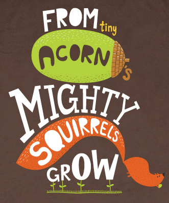
Colourful, bold and visually engaging...

The Boy Fitz Hammond

The Boy Fitz Hammond has been my favourite discovery of the day...
Illustrations of celebrities with witty comment about them at the side; I wish I could just do that for the rest of my life.

There was huge amount of work on the site but thankfully when I opened it, this popped up...

...which is a really great example of type as image.

Supermundane

Siggi Eggertson


These are Really well resolved pieces and are great examples of how digitally made type can create a texture aswell.
The 'paper' image, (bottom right hand corner) looks like its simply made out of textures and there is no outline but when you engage with it, you can still read what it says.

More from Serge...

I've already posted work by this designer (Serge Seidlitz) but they were all from one collection, here are other examples of his work; the top three...make me smile? I just really like them. They're completely llegible and readable; based on existing type but they work great as images.

The last image of the numbers is definately image as type but the fact is, it IS type so it shows how image based it really be. And its funny!

Sean Rees (www.seanrees.co.uk)

Helvetica Love/Hate; Interesting way to show the words, play around with the letters and colours of the letters to determine how it is read.

Love/Hate posters; Bold. Loud! Straight to the point. Can't argue with it.

The typeface...I really like this typeface, it reminds of the building blocks that children get, that are just straight forward geometric shapes.

Once again, something I like about this is that there isn't really a style but they're all striking pieces.

Our Bartlett

The main things I like about these pieces; limited colour pallette, plain backgrounds and crafting!
The cushion says it all.

Mike Perry (www.mikeperrystudio.com)

I've posted Mike Perry before; for the first Type as Image brief, mainly because of his book Hand Job but also because he's a good designer Obviously!

Above are a collection of some of my favourite typography based pieces that he has done.
All of them have a hand rendered feel to them and this is definately something I want to take inspiration from.

2 things I noted from the above pieces were;
The 2 'About a girl' resolutions; they both look completely different and have quite opposite approaches with one being bold, simple, cut out shapes and the other quite illustrative and hand drawn yet the both work?
And...the Bikini typeface; type doesn't have to be drawn!

Melvin Galapon


The main reason I like Galapon's work is because, for most of the pieces, you have to really visually interact with it to see what it says; the middle row pieces, when they were quite large on my screen I couldn't tell what they said...I had to walk away and kind of squint a little and on his site he has a photo of the prints from different angles and just by offsetting the type, it gives it a 3D quality.

Similarly, the last pieces are posters of lyrics, using a 'music' typeface that he created. As the very last image shows, out of context and close up it isn't very easy to read but when you see the posters from a distance it is quite readable.

Interesting!

Lets Kiosk

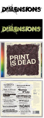
The 'Dimensions' pieces below remind me of non-format/si scott kind of work and I like it but...I do think they have better examples.
I mainly liked the 'Print is dead' CD - Its really simple how they have just covered the pieces with black lines and 'reversed out' Print is dead, and all the tracks on the back look like they have been hand rendered with a biro or something. It creates a really nice texture.

Julien Vallee

I used Julien Vallee for my design context in the first year and I still really like his work.
I believe he is the cover artist for Tangible...the ever so popular 'high touch visuals' graphic design book.
This style of work; 3D to 2D is really popular at the moment and theres no wonder why because it really is visually engaging and easily creates depth etc.

In Vallee's work I specifically like how he can make it work when just using white...but can also use colour really effectively.

Jim Datz

One of the main things I liked about this small collection of type by Jim Datz was that there wasn't a set 'style'; they all look different but they all work.
My favourite one from this is the 'We are young & we are bored'. It works really well as an image, it sits nicely in the frame and the colours are...calming and happy?
Very nice.

Emma Kelly

This illustrator isn't particularly type based...as the URL for her website states 'I like to draw things', but I really like her style of illustration, in particular the line drawings of the gun and the phone. The have a really beautiful quality to them and they have no colour (except the flower coming of the gun obviously).

Really really nice :)

[Edit]
And I believe this is Lady Gaga...?

Emily Forgot

I think the 'Silver & Black' piece above really shows how well image can be incorporated into type; it is really just type and its completely readable yet it works really well as an image because of how the type is extended into other shapes and how they connect.

Damian Correll


The first two images of the decks were a collaboration with Mike Perry.
Its a fun context and creates an audience to aim to graphics at which is helpful.

The other two pieces were his own...
I specifically like the last one; Our best days are behind us! because even though its made out of lots of shapes, textures and kerned a Lot, it captures your attention and makes you want to see what it says and when you look at it properly, it Is llegible so it works as an image and as type.

Billie Jean...

...is not my lover, she's a just a girl who claims that I am the one...

It had to be done.

But in all seriousness, below are pieces of work by Billie Jean.
I was first drawn to her work when I saw a big piece where she'd illustrated all over a piano...it looked so fun! There were other examples where she'd worked on 'different' media such as a wooden desk etc. with what looked like a blue biro (but probably wasn't).

I just really like the hand crafted/rendered, personal feel that her type has and feel that...although it may not all be vectored and perfectly crisp, it still engages the audiences and creates somewhat of a more interesting texture.

Anthony Burrill

Although some additional imagery is used in some of the above pieces, Type is the dominant visual and is what engages the audience really.

I really like how they show that simple typefaces (like the Work hard and be nice to people poster) can be just as effective as more illustrative ones (Short circuit poster)

Andrew Rae

As I spent all yesterday researching the Lady herself, I spent today looking at design context.

I found a lot of new designers and found some that were designers of work I've appreciated before but never known the artist of it (like the 'Play with the city' piece below).
Today has made me love 'Type as image' even more and makes me want to do more of it...which is good considering thats my brief!

Below are a few pieces from Andrew Rae; although they include additional imagery, I really like the way images are involved with the type so it looks like part of the lettering.
I saw the middle 'Play with the city' piece in the Metro sometime last year and I even kept it...now I know who did it!

Serge Seidlitz

The following set of posters were the advertising campaign for ITV comedy/drama 'Married, Single, Other'.
By chance, I found the artist to be Serge Seidlitz and I really like a lot of his work (I will post more later) but in particular I like these because they are really quite simple; purely type based but illustrative type which makes it work as an image and they're all, in their own way, visually engaging; be it from simple use of colour or hand rendered type.

It shows that something doesn't have to be hugely busy with lots of photoshopping and totally digital to be effective.

Love it :D