
Simple Stop Motion Animation
Once again, another example of quite a simple stop motion animation.
I would use a better background - not a desk. However, apart from this I think it works really well and is a great example of d.i.y stop motion.
Stop Motion Rubik's Cube
The few examples I have posted previously, are quite advanced versions of stop motion - but as stated, I want to keep it quite simple. The above example of the rubix cube is visually engaging, fun and simple - just like I want mine to be.
The only negative I have about this is the changing light conditions - but this would probably happen to me anyway.
Her Morning Elegance / Oren Lavie
I don't intend to use any humans/body parts in my animation (i.e. hands) but I had to post this as an amazing example of how stop motion can work - I doubt it was done with 100's of photos, it was probably filmed and edited...which does work extremely well, if it is done in this way.
I really like it and think it shows how - in some cases, stop motion can do what straight forward camera work can't do.
DEADLINE post-it stop motion
I think most people have seen this animation...because its amazing. Similar to the previous post, Its a lot more advanced that something that I would work towards but if I had the time and patience I would love to produce something like this...even though it doesn't look like a stop motion.
It uses such a simple material; post its, but it keeps you watching, and actually has the 'wow' factor.
Vampire Weekend M79 - Corey and Rachel's Wedding Invitation - Stop Motion
As I have already looked kinetic type for one style of animation which I intend to pursue, I have also looked at stop motion...
I really like this example because it looks like a stop motion - this is the effect I intend to go for, otherwise I may aswell just film it. However, this is a lot more advanced that what I would propose/do, I want to keep it quite simple for the time frame I have. If I did have a lot longer, this looks like something that would be fun to do and I expect you would definately feel a sense of achievement in the end.
Kinetic type
The Office;
Stewie Griffin;
Zombieland;
V for Vendetta;
Pulp Fiction;
The kinetic type animation that I intend to do will be relatively simply in terms of animation...and for that, I have looked at videos that most people will have looked at for the 5 short animations that we did in the Design for screen module.
As I will be using the type I have produced for my packaging, it will be more illustrative than the examples posted above - but I will take inspiration from the speed and the ways that they make the words move. I really like the idea of creating an animation to make the pace work with the sound track, however I don't really intend to use a soundtrack/voiceover for mine so it may be more difficult to determine the pace.
MTV SELECT
I have definately not left myself enough time to produce something of this standard, length and...greatness. In terms of style, I actually quite prefer this to super crisp, vectorised animations because it has a more personal, hand crafted feel, even though its a digitial animation.
I would love to do something like this one day, fun fun fun.
ABC3D
This is a beautiful animation...simply just turning the pages of an actual book - it makes the book look so impressive, which it Is when you consider the crafting and how much time it must have taken to design, but once you've seen the animation the book kind of makes you go 'oh'...because it isn't completely smooth and some of the pages get a little stuck etc.
So this is a great example of how video can make something look that bit better than it actually is.
Keaton Henson


This guy is probably my favourite discovery of the year...I've put him on my PPD blog as someone I aspire to be like, he just seems to have my dream job and not only that - he's really good at it too.
Although his work doesn't directly relate to mine in terms of content - he has quite a lot of character design and imaginative illustrative, whereas I am currently focusing more on type as image but the style - vivid colours, humourous and hand rendered, does relate to mine.
I hope to produce work of a similar calibar in the future.
Front Type...


Front magazine was probably my biggest inspiration from my research - it showed me that type as image is suited to the target audience (as they use it and I am targeting a similar audience as their readers). The type shown here is quite varied, which is something I want to focus on as I don't intend for all my type to look 'the same' - it will probably take on a certain style (hand rendered) but I don't want it to all look alike.
I really like the 'style' type - chunky, smooth and fun, and has quite a light hearted feel.
I also like the 'disturbia' type - its very illustrative and looks quite dirty and grimey, which could be appropriate for the cleaning aspect of the tissues.
FHM Type...


Above is some examples of type used in the FHM magazine - it seems largely vectorised or computer generated; the more illustrative/experimental ones are actually from the adverts, so these are the ones most suited towards my design direction, especially the 'havaianes' - its llegible but doesn't look completely computer generate.
Overall, this magazine wasn't particularly 'inspiring' for the direction I want to take - it seems like its trying to be a lot more sophisticated than other 'lads mags' but it is interesting to see the difference between them.
Nuts type...


As I bought a few 'lads mags' as secondary research, once I had decided that type as image was the design direction I was taking - I chose to look at the type used in these magazines (to see what is used in magazines targeted to a similar audience as I am targeting.)
My least favourite out of the examples that I posted above is actually the one used on the cover - I think the others are a lot more visually engaging and generally more interesting to look at.
The one used for 'eva's big boob blowout' reminds me of a Dizzee Rascal ad I saw a while ago, so it shows that this style of type can work for different subjects.
I like the 'Naff Tats' one because it appears to be based on a generic computer typeface, yet by simply drawing/tracing it, it gives it a completely different quality.
Shuffleart and 'Various artists'.
As Kleenex have variation of the same product by just really changing the packaging, I found the following pieces interesting as they show how different styles of work etc. can work across one product.
 The above example of the Bic lighters is interesting because it just uses one tag line across the whole range but just changes the style and colour pallette to suit variations of its audience.

 There isn't really one example from this range that 'stands out' to me, but I do like how some of them have used the shape of the of the product to determine how the illustration works - or the illustration/design reflects what the product does.
Bic;
 The above example of the Bic lighters is interesting because it just uses one tag line across the whole range but just changes the style and colour pallette to suit variations of its audience.
This is something that I could work with if I thought of a particularly strong 'slogan'.
iPod shuffle skins;


The Ronin
 Although I don't think I would use shoes as a form of distrubition...as it isn't really related to tissues and I don't particularly like the actual illustrations, it is interesting to see how the illustration can work across the shape of the show - but not be really 'restricted' by it.
Weihong Su


 I am realising more and more that a lot of the work I am inspired by, isn't hugely like the work I am producing...I don't think this is a problem, but I do hope to work more with illustration in the third year to show a clear link between my context and practice.
Obviously this doesn't have a direct link to my type as image but I just really like the style of illustration - I class myself as 'not very imaginary', so I don't think I could come up with something like this - but the link quality and texture is something that I hope to factor into my work.
The last example appears to have been produced or printed onto a textured stock - even when this is then reproduced on a completely flat, smooth stock, it works really well and gives it a visual texture which can't be achieved with a smooth stock.
Teddy Soegiarto

 Initially, I thought these were by two different designers because the approach is quite different, but once I realised they were by the same person I found it quite encouraging that they can confidently have such different approaches/styles to 2 briefs while still beind successful.
 Although I do like the 2 styles in terms of inspiring my design direction for this self-written brief, I think it will also effect my overall design practice in that I don't need to have a set, visual approach where all my work looks 'the same' to an extent.


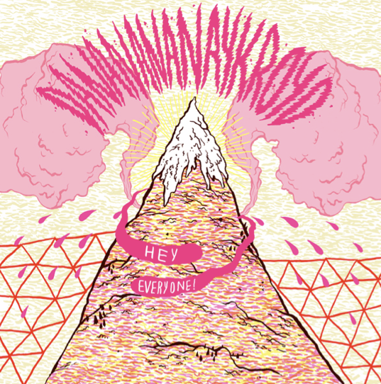
Fabio Berton


In my work, I don't intend to use additional imagery but I think the type alone in the above examples, especially the last 'Spaghette blaster' one, works on its own. I really like the line quality used - quite bold, but I would prefer a more uneven, hand rendered feel.
...The Spaghette type is actually pretty humorous aswell! Which is something I want to work with aswell; portraying a tone of voice by the style of type alone.
Subscribe to:
Posts (Atom)