Packaging Research 7 -

More toothpaste Ads -

1982
Another nice example of cheest American advertising, both mother and daughter has very straight teeth.

1983
Another example of toothpaste being a 'treat' or a present, also the imagery seems to imply that bad teeth are scary.

1986
Initially, I thought this was actually a Crest advert because of the layout, so its quite interesting how they use a similar layout and structure to advertise similar products. Here they seem to be almost trying to guilt the audience into buying the toothpaste by making them feel sorry for her if she Does grow up to have cavities. 'This child could grow up never knowing a cavity in her lifetime.'

Another reason I am looking at toothpaste ads is because 1 factor of having braces I will be promoting is that if you have straighter teeth, it is easier to clean your teeth.

Packaging Research 6 -

Due to the nature of What is Good being teeth, I decided that I would look at advertising orientated around teeth; so, toothpaste.
Another area of my project is the used of stereotypes and stereotypes tend to be based on 'old' things and my research has shown that the basis of the stereotype that British people all have bad teeth does originate from the past, therefore I haven't really looked at recent advertising I wanted to look more at 'vintage' or simply, older advertisements to see how they portray teeth.

I found a great blog where most of my research is from,
www.chronicallyvintage.com.

The author did a post only a few month ago titled:
Adventures in Vintage advertising: brushing up on the history of toothpaste ads.
(Lucky me?)

Pebeca Toothpaste ad - 1917
This was the first image I found when looking for 'vintage toothpaste advert', personally I don't really like the style of illustration however I do find interesting, that toothpaste was advertised as being so important in 1917, interestingly though Pebeco is an American brand.

Listerine Toothpaste as - 1930's
I really like the imagery used in this advertisement, I actually find it quite humorous aswell, which is a tone of voice that I want to portray through my work. The reason I find it humorous is simply the nature of it, that it is 5 women, just 'casually' posing, all smiling, with perfect teeth. "Its safe to say they use listerine!", this style could be parodied and taylored towards my what is good i.e. 5 women smiling, with horrible teeth, "Its safe to say they're British!".

Ipana Toothpaste ad - 1934
The main emphasis of this advertisement was that creamy foods were apparently bad for your teeth, I love how the heading is in a soft, cursive, 'kind' text for the 'Enjoy those', and then they have used a bold, uppercase, serif font for the 'CREAMY FOODS' as if they are something scary. As we have been looking at the tone of voice through typefaces, I can image it would be "Enjoy those" in a nice, calm, soft feminine voice and then "creamy foods" in a big, booming, manly voice.

Pepsodent ad - 1944
I have to say, I found it strange that this advert was used after the previous ones. For some reasons it just looks older, maybe the lack of colour but I suppose they will have still wanted to save on printing costs!
This is another one where the heading/strapline could be taylored for my work. "Do your teeth complete your charm?" is again enforcing the importance on nice teeth.

Gleem toothpaste ad - 1947
This is another example I found quite humorous although I doubt it was intended to be humorous at the time. It seems to imply that by using their toothpaste you will find love, obviously because your teeth are so nice.
I've noticed there was a Lot more writing in the adverts back then? Maybe due to where the advertising was going to be published.

Macleans Ad - 1953
Once again I like the imagery used here, it strangely seems very 'American'. Just because of the stereotypical perfect 'housewife' image and the perfect, gleaming white teeth.

S.R toothpaste - 1957
Here they seemed to want to move away from having people as the main imagery for the advert but obviously couldn't live without it and had to have a littel picture at the bottom however, I think at a glance, the type at the top makes it look like it would be advertising a horror movie or something. I don't find this as interesting as the earlier examples.

Colgate ad - 1960
Slightly strange use of imagery, implying that colgate is so good it should be birthday present? But, once again they have used the 'perfect american housewife' image to show that Good wholesome American families all have good teeth.

I hope to involve some of these examples in my design development.

Packaging Research 5 -

Capsule (US - Specialists in brand strategy,
identity, packaging, and customer experience design services)

Fox River Socks - Shucking Awesome Corn Socks.
Planning:
- The worlds first corn sock that is completely sustainable and annually renewable.
- To average consumers, they would still be 'just socks' - need to make the consumer aware of 'how special' they are.

Creating:
- They created packaging for the socks that tied in the corn sock story into Fox River's history.
- Corn socks became 'a verification of Fox River's vast, quirky tradition'.


Promoting:
"The package and brand launched at a large outdoor retail event in Utah, USA. One pair of socks was shipped to each potential buyer and if they came to the event wearing the socks, they were rewarded".

Although they were promoting a pair of socks, I really like the other items that they included in the package.
"Fox River Tattoo:
Sometimes you've got to enable people to brand themselves...literally. Take a quirky illustrative style and one of our favourite vegetables and you've got one cute temporary tattoo."

All in all, I just really like this whole promotion.

While looking at this, I looked closer at how Capsule work, and on their website the first link is research, which then states:
"Traditional research has its place, yes. But there's no substitute for some enviromentally responsible off-roading to discover something completely new...Out muti-faceted approach encourages collaborative information gathering, ultimately informing any design or stratergy work we do to build your brand".

I felt this was appropriate as we are encouraged to do 'radical research'.

Packaging Research 4 -

Fossil.
Fossil aren't a packaging design company, however, their brand and their packaging really appeals to me.

"Designers who create Fossil tins and watches draw inspiration and colour guidance from designs that originated in the 1940s and 1950s".

In terms of the research I have done so far, I feel the actual design of these is closest to 'style' I would like to develop within my work. As I am looking at 'What americans think of British teeth', to me, the Fossil tins seem to present a very classic american style of design, which I think could lend itself to my work.

Not only do the tins 'look good', they are very reusable. They give you a show piece that has various functions/good looking storage and, I assume they will be sustainable.


Packaging Research 3 -

Karacters Design Group (Vancouver, British Columbia, Canada.)

Packaging Redesign.
Although I won't be designing a bottle for my what is good, I found it interesting to see the process which the designers went through.

Reason for Redesign:
- Falling sales next to the categorys young newcomers.
- No longer looked unique.
- The brand's image was no longer drawing the 'adventurous and fickle' audience.

Redesign Objectives:
- Communicate flavor other than with fruit images.
- Play up the bold flavors and more clearly distinguise different flavors from one another.
- Feature Clearly Canadian's unique clear, carbonated formulation.
- Create an innovate design that would bowl over fashion and design-conscious consumers.


The use of colours and different patterns to distinguish between the flavours, is very successful and I can clearly see why this would appeal to younger, adventurous audience as apposed to the original design.

It definately shows the importance of taking into account the audience you are aiming your product at.

Packaging Research 2 -

Blue Q Chewing Gum
'When a shopper buys a pack of gum he or she in pursuit of the confection. Blue Q asked a new question: What if the equation was turned around and, instead of the gum, the buyer was more interested in the pack.'

A good example of this which was pointed out in the article where I found these examples,
"When baseball cards came packaged with gum, people didn't want the gum. They were buying the cards. Thats what the Blue Q gum is...The gum is merely a transportation for the graphics."

Obviously that point is very american orientated, but I believe it still stands for british consumers. I remember when there were 'prizes' and 'pogs' in crisp packets, people were more excited by what they could win rather than eating the crisps.

I really like the idea that the packaging could become more important than what it is actually in the package.
I thought this was a great example of how you can evaluate your work. It seems that it would be easier to print out a 'net' of the product and scrawl notes on it rather than look at it on screen and write a list about it.


Packaging Research 1 -

These are 3 examples from my design for print research over the summer, however I feel they are still appropriate to my What is Good packaging research:


Enormous Champion (Brooklyn based design 'pair')
Boxlife.
The main reason I like this collection is the simplicity of the design; it seems like it gives you a lot of information about the product but it is presented in such a clear, uncluttered way that it doesn't seem as 'lecturing' or 'boring' as some information design.
Another appeal of this collection was the used of colour, the limited colour pallette and the saturation really makes them stand out from something that see is really busy and cluttered.

Crystal Barlow (Freelance)
Eenie Meenie Baby Bath products.
I used this example in my design for print presentation, and once again it is the colours that I take most inspiration from. I think the use of transparencies within one colour adds a feel of sohpistication to the design.

Boxed Water.


“Started with the simple idea of creating a new bottled water brand that is kinder to the environment and gives back a bit - we found that it shouldn’t be bottled at all, but instead, boxed. So we looked to the past for inspiration in the century old beverage container and decided to keep things simple, sustainable, and beautiful."

In addition to being innovative in terms of packaging water, it is enviromentally friendly and as the designers say 'beautiful'. The way the text is used; 'Smart Sans' font, left aligned and uppercase makes it stand out next to other competitors in the market i.e. Evian water bottles.

British Teeth

Ottrepop music video for their song 'British Teeth'.
Not a well known band but I was just surprised that when I searched British teeth on youtube someone actually made a music video about it...


British Teeth episode 1


British Teeth episode 2

Design for Print - Presentation Slides.

Over the summer, I bought The Production Manual* and can honestly say, it is probably the most helpful/benificial Graphic Design book that I own and understand!
Below are my slides from the summer brief presentation:

Slide 1 - This quote was taken directly from The production manual, I thought it was a clear, simple explanation to colour limitations with CMYK.
Diagrams taken from: The production manual and Graphic Design: The new basics.


Slide 2 - Image taken from Graphic Design: The New Basics.
Although I presumed everyone would probably know the 'optical colour mixing' used on billboards, I still thought it was a valuable thing to point out when understand how colour works.

Slide 3 - These are two examples that I found on the internet where I think the layering of colours works really well.
Skinny Ships - This is a good example of how layering two colours can make a third colour, saving the designer money as they only have to pay for the use of 2 inks.
James Joyce - I think this is an interesting example of how you can optically create another colour by the positioning of colours next to each other; because the blue dots are layed on top of an orange background it makes the blue look like a slightly different shade. (The dots are more obvious when the image is larger.)

Slide 4 - When I was presenting this at college, I skipped past this slide because I didn't really understand what a spot colour was and I wasn't sure how duotone worked, but now that I understand them both more, I feel more comfortable showing the slide!
The spot colour diagram and text were taken from The production manual.
The duotone explanation was taken from wikipedia...(because I couldn't find an explanation that I understood anywhere else.)

Slide 5 - After looking at the technical use of colour in printing, I went on to look at examples which were appropriate to me i.e. Print design that I like.
Crystal Barlow - The shampoo bottles are visually interesting examples of the use of tones or tints in print; in my opinion it makes a simple shampoo bottle look a lot more elegant than something like a Pantene or Head and Shoulders bottle. I would rather have on of these on display in my bathroom.
BVD - a set of gift bags and boxes for H&M, used around valentines day. I thought it was a modern example of the use of bold colours and bold, simple sans serif text to portay a message quickly i.e. you wouldn't expect them to use these bags at easter, but it isn't cheesy and over-the-top like some valentines merchandise.

Slide 5 - I love different stocks; I like to feel work aswell as just look at it.
Stuck - This is a business card for a "Lawn and Property enhancement company". The use of stock is appropriate to the business in this instance as they're a business that deal with nature (lawns etc.) and it looks like a 'natural' made stock, or recycled (Im not exactly sure what you would call it...but kind of looks like a more elegant sugar paper!)
Big Fish - This is packaging for Dorset Cereals, I have noticed it numerous times in the supermarket and I definately think it stands out from other cereal boxed on the shelf. The stock used for this is almost like the insides of other cereal boxes as it isn't glosses but again, this seems appropriate to the brand as it is 'Honest, Tasty and Real Unadultered cereal', so the fact they are branding it as honest it almost doesn't need the 'glossy cover up', the stock is what it is. It also makes the cereal box look a lot more sophisticated than things like Kelloggs because of the foil print etc. (I like these cereal boxes a bit too much!)
Round - This is packaging for a sandwich shop which wanted to make their wrapping more enviromentally friendly. In my opinion the design, stock and limited colour palet make it look a lot more 'classy' than the packaging for places like McDonalds and Subway.

Slide 7 - As the issues with the environment plays a big part in all areas of the world, enviromentally friendly design is becoming more popular.
60 Bag - This is a bag which bio-degrades in 60 days, obviously the stock is a large part of this design but also the small amount of ink used makes it more 'enviromentally friendly' although I'm not sure what sorts of inks are used.
Frost* - This is another example from The production manual, it is a book documenting the company Frost*'s first year of business. To go along with their enviromentally friendly image they printed it on a recycled stock with vegetable inks. I think the fact that it will look different to other books and feel different will make it stand out from others, which in turn is promoting their business even more.

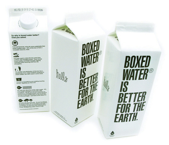
Slide 8 - I've noticed recently how many drinks packaging designs there are, they're everywhere.
These are a few examples of ones that I think are successful and visually appealing/making them stand out.
I really like how you can keep the same design and just change the colour and people instantly know its a different flavour; the Alvaro Rubio bottles are one of my favourite examples of this. Instead of using coloured tops to communicate the type of milk, it just an illustration of a cow in different colour; it looks a lot more sophisticated than morrisons own milk!

Slide 9 - Although the actual design isn't my favourite billboard in terms of being visually engaging, I felt it was a valid thing to include these because - the nature of billboards and bus posters etc, do they need to be Really visually engaging? Most billboards etc. are in places that you will drive past quickly etc. so you don't really have time to appreciate the aesthetics of the posters, however I always read these adverts when I go past them because it is really bold, simple and quick to read, so for these reasons I do think it is a successful campaign.
However, after analysing them and thinking this...I realised, I didn't know that it was promoting The Alpha-Course until I was in the car, behind a bus at some traffic lights and saw the logo at the bottom...so, maybe this makes it less successful Or they were simply hoping that once you read the question, you would research it?
Regardless, I think the content of the campaign is interesting but I think it could look a bit more interesting.

Wow. This is probably the longest post I've ever done :)
x