Magazine Layouts

I gathered inspiration for magazine layouts from various sources...
Here are a selection:


I'm not sure if this was printed this way, but I like the idea of using a coloured stock and just using black ink.

The main reason I chose this, was not specifically for the layout...but I really like the way that the page numbers are highlighted.

The main inspiration I took from this magazine layout, what having the text quite small the the bottom and the main focus on the image / content at the top of the page.

This is simply a really nice example of a contents page.

I took inspiration from the above DPS to rotate one of my DPS' as I think it looks more visually engaging.

Once again, a nice example of using coloured stock.

I think this is a really beautiful example of using a full page image and it also shows that the opposing page doesn't need a huge amount of text on it.

Images to use in my booklet...

In addition to simply researching magazine layouts, I decided I wanted to include graphic examples of various techniques, here are a few examples of what I chose...

4 Spot Colours -

Monotone illustration -

Monotone photo -

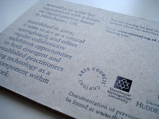
Stock - Greyboard -

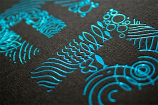
Foil Blocking -

Laser cutting -

Thermography

More Packaging 2 -

The Kraken Media Kit.
The Kraken Black Spiced Rum.


Contents: Kraken tooth, Kraken ink, a log book, a scroll, a feather, movies of the Kraken and a bottle of Kraken Rum.
The kit is set up as a 'proof' kit, each element inside is one piece of proof that a mythical Kraken sea monster exists.

I'm not really sure what it is that drew me to this, I think it was the simple black print on a brown stock/box and the style of illustration, but when I saw what was inside when you opened it up I pleasantly surprised. It reminds me of something you would see on a old film, that people take with them on a boat trip or something...I really don't know why it reminds me of that, but it does.

As I am looking to take a more sophisticated approach, I think this is quite appropriate in more ways than one because:
Colour pallette - The limited colour pallette and stock choices make it look quite elegant.
Style - Although it looks quite contemporary, I personally think that the style, the feather and ink and the contents (rum) are quite traditional and 'old'; I think the contrast between modern on tradition works really well here and it is a 'style' that I would like to carry through into my designs.
Tone - Even though it looks and seems quite serious, its about a mythical sea monster...I think its safe to say they aren't being serious and this is a style of humour that I really like in design, its not 'LOL', in your face funny.

More Packaging 1 -

Having thought long (Very loooong) and hard about where I want to go with my packaging etc. I kind of had a change of heart after a 'brainwave'. I still want humour to be apparent in the product and the package but I also want to have a take a more 'sophisticated' approach.
Something I was concerned with before was the sustainability of the packaging etc. and I later realised if I promoting braces, if someone really wants to keep the packaging of something they aren't usually concerned with the stock or material i.e. tin or board, and similarly, if I did go down the route of making something out of tin or a more sustainable material, if they don't like the design, they aren't going to keep it.
So, more recently I have been looking at simple, cost effective packaging so also 'look nice' for the consumer. Here are a few examples:

Elle Macpherson Intimates (Designer: Container, China/Australia)

This is a 'drawer box' for gifting multiple pairs of underware, using sliding tray, the product came fully boxed with bow included. I thought this was a simple, contemporary way of packaging quite a boring product and I think it works really well for the target audience (women) as not only is the product a necessity (for most women...) but the gift box is almost an added gift because it could be kept and used for other things i.e. a giftbox to send a different product to someone else.

Presence in Abscence (Designer: Colm Keller, Sweden)


This was the designers 'Masters Thesis project', he wanted to highlight the issue of increasing long-distance relationships and the drawbacks of computer mediated communication. In all honesty, I wasn't really concerned with the idea behind the packaging, it was simply the packaging that drew me to this. I'm not a huge fan of the material that has been used, but i'm sure it has a meaning to the project, but it is mainly the way it folds and how the product it securely held in place; I feel it would be quite a 'pleasant experience' when the consumer opens it up and once again, it is probably something they would keep .

400 Costumes to Die For (Designer: GS Design, US)


"Designed to help recipients decide what to be for Halloween, the piece consists of two custom-made, 20 sided dice - one with 20 modifiers, the other with 20 nouns - that together offer 400 possible original costume combinations (Zombie elvis, Kung Fu Jesus etc.)...The is tube is an economical one-colour hot stamp on black paper. The instructions were printed as one colour labels and affixed to the inside of the lid"
I really think this is just an all around great product and package...I want one.
But, the reason I chose to put it up here was because I think it is a really good example of one colour printing, and its one solid colour, no tones etc. I also think it is effective how the packaging is so much bigger than the actual product, it makes it more of a 'surprise' when the consumer opens it.

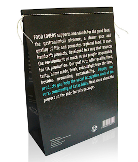
Food Lovers - Organic Coffee (Designer: Isabela Serta, Brazil)


I didn't really pick this for the design, it was more because of the way the packaging is sealed. I hadn't really considered different ways of sealing something until I saw this, I assume this has been packaged in that way to keep it air tight but it could be really be adapted to most things (as long its thin enough to be sewn obviously) plus, it is visually interesting aswell.

Debonair Cigars and Tabacco (Designers: Royaly, US)


"Debonair Cigars and Tobacco are designed with a focus on the early 1900's. Stay confident, stylish and charming."
This was another example that I saw and just loved it straight away. It almost makes me want to buy a cigar, just so I can get that box and sleeve. I really like how it has incorporated the 'focus on the early 1900's' yet it still looks contemporary. This is made out of wood, therefore sustainable and I assume the recipient would keep it but the idea of a simplistic box with a sleeve could be simulated in various materials. In addition to the packaging, I think the brand image is great aswell; bold, one (or possibly 2 colour) and humourous.
Love it.


Stock and Finishing

Taken from the book mentioned in the previous post:

Stock:


(Quite self explanatory if you make the image bigger.)

Finishing:
Kiss-cut:
I wasn't really sure what to look for when I got to the 'finishing' section, but I came across this example of 'kiss-cutting' which basically mean, you can cut just halfway through the stock therefore if you're using a self adhesive vinyl and you only want the shape of the sticker cutting around but the sheet left untouched behind the stickers, it can do this. And, just found out the today they now have a vinyl cutter downstairs that can do this which is great.

I'm not sure in what context I would use the kiss-cutting technique for this particular project but it is definately something to bear in mind.

Promotional Print

I found a great book in the library called 'Print and Production finishes for Promotional Items'.
I could have put every page of the book up here but I narrowed it down to methods etc. that I could consider in my design development.

The examples that I collected, I put them into different categories so I will put Stock and Finishing onto a following post.

Printing:
Acid Etching:
I'd never really thought about how they printed things like this before, but after looking at the Fossil tins and thinking about different materials I could use, I thought this would be a nice way of updating something and making it look contemporary, sophisticated and stylish.

Rubber Die:
This example really made me laugh, it is an invitation to someones birthday party with the tagline "Get plastered!" and its printed on plaster board, ingenius!
In terms of the printing method, it is a 'relatively' cheap method and its easy to do, especially when printing in one colour on an awkward material i.e. plasterboard.

Monoprint:
Obviously I knew what monoprinting was before I looked in this book but I just thought this example was a nice use of the colour limitation and the effect that using a photocopier can create; makes it look somewhat textured.
(Look at print research for method used here...)


50's Advertising

While looking at the old toothpaste ad's, I realised how much I like American advertising in the 50s...and I can't really explain why, but I thought I would look at other examples so that I could possibly carry the 'style' through into my work.

I got a book from the library called All American ads: 50's. It is absolutely Huge (Amazon says the paperback version has 928...thats a lot of adverts.)

There were a lot that stuck out to me, but the main 4 examples are below.

I thought the one above was appropriate simply for the illustration of the woman, this advert is from the 1950's and look how perfect her teeth are?
Its becoming more and more evident through my research that Americans probably just think our teeth are horrible because they're so obsessed with theirs and make them look un-natural.

This ad is for a the 'Revere 33 Stereo Camera' in 1952, once again the main thing that attracted me to this was the illustration or more specifically, the facial expressions. I don't just want to copy the 'style of illustration', but I think the faces they're pulling and the colour are quite identifyable with the time period.

Of course, once I found a toothpaste ad...a 'Green Toothpaste' ad, in there, I had to have it.
Although in addition to the subject of the advert, it made me start thinking about colours. Although some of them have got 'realistic', typical skin tone colours etc. I've noticed some do have a limited colour pallette, for example - the above colgate ad appears to just use black and green. The stock also looks quite 'aged'

(PUT MOTORCYCLE AD HERE. BLACK AND RED)


Packaging Research 7 -

More toothpaste Ads -

1982
Another nice example of cheest American advertising, both mother and daughter has very straight teeth.

1983
Another example of toothpaste being a 'treat' or a present, also the imagery seems to imply that bad teeth are scary.

1986
Initially, I thought this was actually a Crest advert because of the layout, so its quite interesting how they use a similar layout and structure to advertise similar products. Here they seem to be almost trying to guilt the audience into buying the toothpaste by making them feel sorry for her if she Does grow up to have cavities. 'This child could grow up never knowing a cavity in her lifetime.'

Another reason I am looking at toothpaste ads is because 1 factor of having braces I will be promoting is that if you have straighter teeth, it is easier to clean your teeth.

Packaging Research 6 -

Due to the nature of What is Good being teeth, I decided that I would look at advertising orientated around teeth; so, toothpaste.
Another area of my project is the used of stereotypes and stereotypes tend to be based on 'old' things and my research has shown that the basis of the stereotype that British people all have bad teeth does originate from the past, therefore I haven't really looked at recent advertising I wanted to look more at 'vintage' or simply, older advertisements to see how they portray teeth.

I found a great blog where most of my research is from,
www.chronicallyvintage.com.

The author did a post only a few month ago titled:
Adventures in Vintage advertising: brushing up on the history of toothpaste ads.
(Lucky me?)

Pebeca Toothpaste ad - 1917
This was the first image I found when looking for 'vintage toothpaste advert', personally I don't really like the style of illustration however I do find interesting, that toothpaste was advertised as being so important in 1917, interestingly though Pebeco is an American brand.

Listerine Toothpaste as - 1930's
I really like the imagery used in this advertisement, I actually find it quite humorous aswell, which is a tone of voice that I want to portray through my work. The reason I find it humorous is simply the nature of it, that it is 5 women, just 'casually' posing, all smiling, with perfect teeth. "Its safe to say they use listerine!", this style could be parodied and taylored towards my what is good i.e. 5 women smiling, with horrible teeth, "Its safe to say they're British!".

Ipana Toothpaste ad - 1934
The main emphasis of this advertisement was that creamy foods were apparently bad for your teeth, I love how the heading is in a soft, cursive, 'kind' text for the 'Enjoy those', and then they have used a bold, uppercase, serif font for the 'CREAMY FOODS' as if they are something scary. As we have been looking at the tone of voice through typefaces, I can image it would be "Enjoy those" in a nice, calm, soft feminine voice and then "creamy foods" in a big, booming, manly voice.

Pepsodent ad - 1944
I have to say, I found it strange that this advert was used after the previous ones. For some reasons it just looks older, maybe the lack of colour but I suppose they will have still wanted to save on printing costs!
This is another one where the heading/strapline could be taylored for my work. "Do your teeth complete your charm?" is again enforcing the importance on nice teeth.

Gleem toothpaste ad - 1947
This is another example I found quite humorous although I doubt it was intended to be humorous at the time. It seems to imply that by using their toothpaste you will find love, obviously because your teeth are so nice.
I've noticed there was a Lot more writing in the adverts back then? Maybe due to where the advertising was going to be published.

Macleans Ad - 1953
Once again I like the imagery used here, it strangely seems very 'American'. Just because of the stereotypical perfect 'housewife' image and the perfect, gleaming white teeth.

S.R toothpaste - 1957
Here they seemed to want to move away from having people as the main imagery for the advert but obviously couldn't live without it and had to have a littel picture at the bottom however, I think at a glance, the type at the top makes it look like it would be advertising a horror movie or something. I don't find this as interesting as the earlier examples.

Colgate ad - 1960
Slightly strange use of imagery, implying that colgate is so good it should be birthday present? But, once again they have used the 'perfect american housewife' image to show that Good wholesome American families all have good teeth.

I hope to involve some of these examples in my design development.