These are 3 examples from my design for print research over the summer, however I feel they are still appropriate to my What is Good packaging research:
Enormous Champion (Brooklyn based design 'pair')
Boxlife.
 The main reason I like this collection is the simplicity of the design; it seems like it gives you a lot of information about the product but it is presented in such a clear, uncluttered way that it doesn't seem as 'lecturing' or 'boring' as some information design.
Another appeal of this collection was the used of colour, the limited colour pallette and the saturation really makes them stand out from something that see is really busy and cluttered.
Crystal Barlow (Freelance)
Eenie Meenie Baby Bath products.
 I used this example in my design for print presentation, and once again it is the colours that I take most inspiration from. I think the use of transparencies within one colour adds a feel of sohpistication to the design.
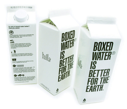
Boxed Water.

 “Started with the simple idea of creating a new bottled water brand that is kinder to the environment and gives back a bit - we found that it shouldn’t be bottled at all, but instead, boxed. So we looked to the past for inspiration in the century old beverage container and decided to keep things simple, sustainable, and beautiful."
In addition to being innovative in terms of packaging water, it is enviromentally friendly and as the designers say 'beautiful'. The way the text is used; 'Smart Sans' font, left aligned and uppercase makes it stand out next to other competitors in the market i.e. Evian water bottles.
Enormous Champion (Brooklyn based design 'pair')
Boxlife.
 The main reason I like this collection is the simplicity of the design; it seems like it gives you a lot of information about the product but it is presented in such a clear, uncluttered way that it doesn't seem as 'lecturing' or 'boring' as some information design.
Another appeal of this collection was the used of colour, the limited colour pallette and the saturation really makes them stand out from something that see is really busy and cluttered.
Crystal Barlow (Freelance)
Eenie Meenie Baby Bath products.
 I used this example in my design for print presentation, and once again it is the colours that I take most inspiration from. I think the use of transparencies within one colour adds a feel of sohpistication to the design.
Boxed Water.

 “Started with the simple idea of creating a new bottled water brand that is kinder to the environment and gives back a bit - we found that it shouldn’t be bottled at all, but instead, boxed. So we looked to the past for inspiration in the century old beverage container and decided to keep things simple, sustainable, and beautiful."
In addition to being innovative in terms of packaging water, it is enviromentally friendly and as the designers say 'beautiful'. The way the text is used; 'Smart Sans' font, left aligned and uppercase makes it stand out next to other competitors in the market i.e. Evian water bottles.

No comments:
Post a Comment